Reptiles by Marius Cornelius Escher, 1943 (Lithograph)
Description and Analysis
This work depicts a seemingly ordinary desk. On top of the desk, there is a tessellated drawing of reptile forms which are closely packed. The tessellated reptiles seem to come to life and emerge from the paper's surface, coming to life as a living reptile. After the reptiles become fully 3 dimensional and alive, they crawl around the cluttered desk, over multiple everyday objects such as a book and set square before they eventually descend and re-enter the drawing. The desk is covered with several ordinary mundane objects such as a cactus pot, a wine glass and bottle, several books and most prominently, a metal dodecahedron. The reptiles climb over the dodecahedron and the one standing on it appears to be blowing smoke from its nostrils, suggesting that it has fully come to life and this symbolises the reaching of the peak before descending to eventually merge with the 2 dimensional tessellation pattern.
The forms are depicted in such fine and photo realistic strokes, and yet the juxtaposition of forms and altering of sizes makes it unnatural. The movement of the baby crocodiles is contrasted against the relative stillness of the surrounding objects, creating a silent tension in the work. The organised arrangement of the ring of crocodiles also adds to a rhythmic fluidity. He has effectively portrayed the mathematical relationship among shapes, figures and space in this work. Different forms seem to interact with one another in this work and every form is interlinked. There is a contrast and contradiction of still-unproportional objects with the moving reptiles(the still and upright vs. fluid movement). The contrast between the hard, angular edges of some objects on the table to the relatively soft and rounded form of the reptiles also make the work look interesting.
The composition is rather well balanced, making it look like an ordinary table top which is filled with objects. The objects look like they are randomly strewn about on the table but the objects are clean and posed, which makes the viewer feel uneasy due to the irony present in the work. The forms are distorted in terms of their size so when they are placed side by side, they look starkly juxtaposed.
Different heights of the objects create variation and 3 dimensionality in the work and the ascending and descending movement of reptiles guide the viewer's eye movement in a circular motion.
A tonal variation of gray exists in the work, which contributes to the shadows so as to portray a realistic depiction of forms. The different tones of gray are carefully placed and Escher makes a meticulous effort to differentiate his forms from each other through the use of tonal gradients. The colours play a crucial role in helping us to make out the positive and negative spaces in the work. They also add a sense of depth to his work, so that his work stands out of a flat 2 dimensional surface.
This work by M.C. Escher is a seemingly ordinary work which exudes a subtle sense of creepiness, which is further reinforced by the usage of black and white tones, as if suggesting something ominous. Textures also exist in the work, which is further highlighted by the fine realistic brushwork and application of tonal gradients. For example, we can clearly see the roughness of the reptiles' backs due to the realistic depiction of their body. This allows the viewers to feel the details of the work and appreciate every surface of each form.
The reptiles existing in this work can be split into 2 distinctive groups which serve as a contrast to each other: The simplified, abstract forms vs. the detailed, sculpture-like forms. The use of perspective here and impossible spaces is cleverly employed by Escher. He uses the carefully arranges the baby crocodiles such that they form the guiding line for the viewers' eyes, allowing them to explore the work that Escher wants them to. There are also multiple focal points in the work, but the central focal point would be the tessellation pattern as it is enclosed by a ring of crocodiles, emphasizing the subtle presence of the 2 dimensional geometrical pattern. The reptiles are arranged in a cyclical formation, such that they travel in a never ending circle, suggesting the notion of the infinite. It is like the life cycle of the reptile, where they ascend from the 2D surface to become a 3D form and then descend into a 2D form again. This is a cycle of continuous and endless resurrection, continuing into infinity.
The 2 dimensional reptiles are simplified and abstract, with just the basic outlines to define their forms. These singular geometrical, hexagonal and angular reptile forms also contribute to the basic unit of a tessellation, in which these shapes are arranged differently to complement each other. The tessellation repeats itself like a continuous multiplication of forms. As 2 dimensional as it may seem, two "uncompleted" tessellations are actually partially transforming into 3 dimensional reptiles, contributing to the magical element of the work. This reflects Escher's witty play of the reptile figures in a regularly divided plane, adding to the surrealistic quality of the work. There is a repetition of the reptile motive in both 2D and 3D form, and this recurring image makes the viewers question the individuality of the reptiles and the "over-usage" of reptiles which look menacing is actually creeping the viewers out, making them feel uneasy. The merging of 3 dimensional and 2 dimensional forms is as if as Escher is playing with our subconscious mind by telling us to question what the true form of the crocodiles are. The distinction between a visual art piece and stark reality becomes less defined, playing with our senses and confusing them, and this adds to the surreal quality of the work. He deceives us with perspective and perception. He is telling us that the impossible is happening right before our eyes. The idea of metamorphosis is present. The most obvious one would be the morphing of 2 dimensional forms into 3 dimensional ones and vice versa.
Escher has also employed the use of several mathematical concepts in the work. It is evident that he has used the concept of rotational symmetry to create his reptile tessellation. He has also used geometric shapes in his work. The books and the cigarette box form the more rectangular shapes while the glass cup, the bowl and the cactus consist of more circular shapes.
Interpretation
Along with many art critics, I believe that Escher's work does not hold any deep meaning to it - the image is created to depict a paradoxical world and it was created because he felt like creating it. I do not think that there is a philosophical or hidden message behind this work, unlike many Surrealist artists like Rene Magritte who use symbolism to convey hidden messages in their works.
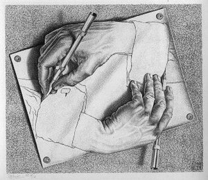
I think that through this work, Escher has expressed his interest in mathematics, particularly geometry and tessellation. He likes to explore the idea of infinity and the idea of "creating the impossible reality" and he has created many works due to his fascination and desire to share his excitement for the idea of eternity. The objects on the table and reptiles are both arranged in a circular manner, providing a cyclical frame to the whole composition, which again brings out the notion of infinity, as a circle is never-ending. He has created a paradoxical, unrealistic world which looks bizarre and mystical at the same time. His interpretation of mathematics has been a recurring basic idea of most of his works, such as the print below, which shows the never ending journey of ants.

I believe that Escher has achieved his aim of creating such a surrealistic image. He has also demonstrated his skill and proficiency in his chosen medium - lithography, making him a skilled and creative artist. He was actually considered to be the creator "of some of the most intellectually stimulating drawings of all time" and the king of visual illusions.
Even though his lithograph did not aim to bring out any message, but he is definitely successful in creating an ironic reality. Although surrealistic works are usually heavily laden with symbolism, I believe that Escher creates are because he wants to and because he is passionate about art, so I shall respect his intentions to just create a paradoxical image with no specific message behind it.
No matter what, I believe that it is one spectacular piece of work that is meticulously created with skill and precision.
COMPARISON WITH ESCHER'S OTHER WORK
Personally, I think that Reptiles can be compared to many of his Lithograph works, as the idea of infinity and impossible, warped spaces is a common theme that is repeated. Escher is a master of visual deception, bewildering us by presenting impossible images which actually look possible.
However, I think that Reptiles bear the most similarities with Relativity(1953) so I shall choose this work for comparison.
 Both Relativity and Reptiles are created using monotone colours of mainly black and white, with tonal variations of grey. The different intensities of the tones used actually bring out the sense of depth and space in each of the works, but it is more prominent for Relativity. In Relativity, the central focus, which is encircled by the triangular formation of the oddly positioned staircases, is of a lighter shade as compared to its surroundings. This effectively draws the audience's attention to it and highlighting the fact that the arrangement of the staircases is practically impossible but what is strange is that this strange arrangement seems to be calmly set up and placed together, which makes the work even more puzzling. The usage of impossible spaces is very prominent in both works. Reptiles play with the idea of merging 2D and 3D planes together, while Relativity defies the notion of having a single perspective, by merging many types of perspectives together, making the viewers question what is upright and what is not. The use of positive and negative spaces to create a sense of depth in both works, bringing us through a seemingly impossible and unknown image. However, the setting of both works are different. In Reptiles, the subtle action takes place on a table top, while in Relativity, there is more action and chaos, as the whole scene is taking place in an upside down, downside up world, defying the notion of gravity. Both employ the use of diagonals to create the notion of infinity and endlessness. Furthermore, to make his works more interesting, Escher places characters which are alive into both works, contributing to the sense of movement and liveliness in the monochromatic works. The characters in both works have lost their personal identity and they look similar with the other characters in the same work, creating a sense of uniformity. In Reptiles, there are a few 3 dimensional alligator-like creatures crawling over the table and metal dodecahedron, but the reptiles look oddly symmetrical to each other, like the symmetrical and repeated patterns of the 2 dimensional reptile tessellations. In Relativity, the abstract, simplified human forms are faceless, stripped of their personal identity to become emotionless, random people made to live in an impossible world. However, I feel that the characters in Relativity are more interesting. Each character, although similar to one another, is engaging in a specific unique activity. They can be climbing the stairs, looking over the balcony, carrying objects, interacting with each other etc. This gives the supposedly identical clones a unique identity as they are different from each other, making each character special and essential for the vitality of the work. In Reptiles, the reptiles are just merely climbing over the different objects with the ultimate aim of re-entering the flat 2 dimensional tessellation surface and resurrect again. Since they are all crawling, they lack the personal identity as they are all engaging in the same activity. Therefore, the viewers will not specifically take notice of each reptile unlike in Relativity, where each character is different in its own way. One unique fact about Reptiles is that Escher contrasts the 2 dimensional and 3 dimensional forms, while in Relativity, Escher plays with the placement of 3 dimensional forms. The forms in Reptiles are portrayed using more realistic brushwork while the forms in Relativity are depicted in a more simplified and abstract way, so as to bring out the absurd use of perspective present in the work.
Personally, I feel that Relativity has a greater impact on the viewers. Reptiles is a subtle and slight distortion of our everyday world, but Relativity is the stark and obvious manipulation of our everyday world, twisting it into a strange, foreign world. The use of impossible spaces is more obvious in Relativity and I think that this image will create a deeper impression as compared to Reptiles. There is a subtle juxtaposition of unrelated forms in Reptiles, but in Relativity, the juxtaposition and unrealistic arrangement of forms dominate the whole composition, morphing the whole composition into one magical world. Furthermore, there seems to be a lack in shadows(the character's shadows) in Relativity but there are shadows in Reptiles. Relativity is obviously distorted while the distortion present in Reptiles is more subtle.
"Only those who attempt the absurd will achieve the impossible. I think it's in my basement...let me go upstairs and check. " -MC Escher
COMPARISON WITH ANOTHER WORK

I would also like to contrast Reptiles with this beautiful art piece that I have seen at the SYF Arts and Crafts Festival. It was one of the first few works that I saw at the gallery and I was immediately captivated by the work when I saw it! It is carefully drawn out using a fine black pen, with intricate lines and careful, meticulous shadings. This work is simply breathtaking. I love every part of it - from the graceful fluid forms to the photorealism of this piece. (I'm really sorry, I didn't record down the title of this work! >.<) I think that the artist was influenced by a number of surrealists. The spirals actually remind me of Dali's works as Dali uses a lot of fluid spirals in his works. The usage of the clouds imagery is reminiscent of Magritte. But Escher's influence is the most prominent in this work as they can be closely associated.
This young artist was most likely influenced by MC Escher's bizarre looking, paradoxical lithographs. The ideas of infinity and endless cycles are present in both works. Even their subject matter is somewhat similar! The reptile form and the repeated use of tessellation are present in both works! However, the setting is different. In this work, the setting is among the clouds, adding a surrealistic element to it, while Escher's image is taking place on top of a table with everyday objects. Both works use shapes, especially circular shapes, to suggest the notion of endlessness and continuity. But the use of spirals is more dominant in this work. For Escher's, the spiral is quite subtly formed by the reptiles which are crawling over the table. In this work, only one reptile can be seen and it is magnified, dominating the whole composition, with intricate, repeated patterns carved unto his back. In Escher's work, there are a few reptiles present and all of them seem to look identical to each other, thus losing their individual unique identity but in this work, the reptile is unique as it stands out, different from the reptiles that we encounter in everyday life.
While the use of monochromatic colours is prominent in both works, both artists use different medium to portray their image. Escher uses lithograph, while this artist uses the humble pen. This young artist has also adopted Escher's use of tessellation and incorporates it skilfully into his artwork! Credits to him/her for being able to do that!
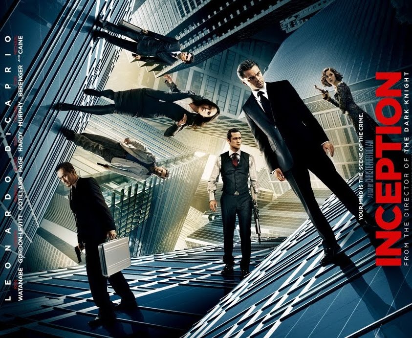
By the way, Escher has not only influenced this young artist over here, but he has played a part in shaping the modern entertainment industry!
TESSELLATIONS


Escher uses mathematical concepts to create his works. For example, for the reptile tessellation, he employs the use of rotational symmetry to create reptile forms carefully joined with one another, leaving no gaps in between. He has experimented with the forms, morphed them, twisted them and abstracted them to suit his liking. The idea of positive and negative space is clearly used to differentiate each tessellation piece. His tessellations have effectively combined the great ideas of mathematics and art.
Here is a video on the mathematics in Escher's art! (:
As the video has pointed out: "The legacy lives on". Indeed, Escher's ideas are still influencing us up till today and this genius will never be forgotten. By the way, many mathematicians admire and actually love Escher's works(well, because it fuses both math and art). The works that he had created have merged both science and art, which used to be 2 separate fields. I believe that this is what differentiates him from many other artists. His works have a continuous influence in both science and art. His ideas have been used in philosophy, topology, crystallography etc.
Here's a video of a 3 dimensional sculpture of Escher's Waterfall. Well, I thought it was impossible to construct, but the guy in the video just did! O.O How did he do that? Maybe he employed the use of several mathematical concepts to create this seemingly impossible construction.

To end off the post, here is an Escher documentary: