Showing posts with label Oil Painting. Show all posts

Monday, October 22, 2012

first post after EOYS:D

Why am on this blog on this random day?    O.O I just spoiled my keyboard because of ants-.- long story though...

Argh getting back 4 subjects papers tmr! Crossing fingers and toes! >.< Oh yeah I need to post up my recent art but my stupid com can't read my cam's memory card! Oh well..

Hmm, sneak peek! (: Not completed though. Close to completion. But here's the progress (:

Oh and I screwed up the bird's head. I wanted to make the feathers puff up and I keep adding paint on its head and it became like this-.-Now the bird looks ROUND AND FAT >.<

Charcoal Sketch as base


First layer of paint

2nd layer
 
Ok then I went on a 4-5 months long break from this painting...Well, it was done in june hols and I had to go back to school so... and I finally went back to the studio again during Marking Day hols! (:
 
3rd layer - poor birds gained a lot of fat and feathers after I went back -.- at least the background looks nicer now(:
I just realised that my birds look like hybrids that is a cross-breed between birds and bears>.<


At least the birds are quite cute I hope? >.< They are fluffy!


Wednesday, June 6, 2012

4th oil painting :D

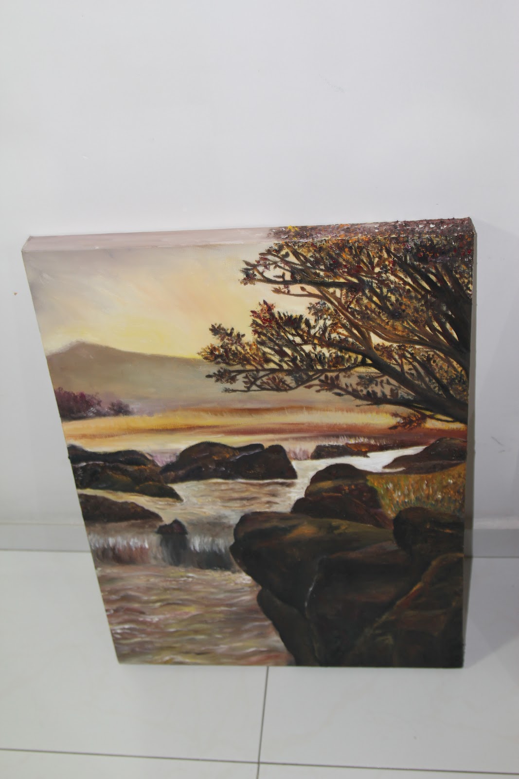
                                                         AUTUMN
   2012
     Oil on Canvas

Finally done after a 2 month hiatus! :O


                                                       Front view(:                                            

Top view and side view! (Yay I painted the sides!)

                
The starting point. :/ Yellow wash as the base with rough outline of forms using charcoal. It looks like a desert that was hit by a sandstorm. >< As you can see, the starting is really...simple, I only drew the basic forms because I wanted to paint so badly(or maybe I was too lazy :/ ) and I can eventually correct the forms by applying layers of oil paint! By the way, the completed work is filled with textures! The rocks and tree are rough and 'pokey'! :)

The colours are mostly applied by imagination and even though I did refer to the original picture at the start, I realised that it is quite impossible to capture every single detail and every colour accurately. So I gave up on referring to the picture and start applying colours based on what I feel as I believe that this will give the painting a sense of personality.(:

I like this painting because it has a warm feel to it. XD

Friday, February 3, 2012

Under the Starry Sky....

There is a tree! (:

Ok, so here is my third oil painting! (: Well, I like how it turned out, but the grass was not very successful. ): I like to paint skies with loads of colours and a dreamy effect! (:

                                                   UNDER THE STARRY SKY
                                                                      2012
                                                          OIL ON CANVAS

Well, there is actually texture in the painting too! Especially the stars that are big and the texture of the tree is actually rough!

Tuesday, January 10, 2012

DREAMING :D My second oil painting

                                                                         
                                                                     DREAMING
                                                       
                                                  2011, during the December holidays

                                                                   Oil on Canvas

Yay yay so this is my second oil painting done in the art studio! (: I really like it! (: It gives off a really dreamy effect which makes the cardboard figure/robot look like it is hoping for something! I chose this picture as I thought that the sky is challenging to paint and I want to take up the challenge!

Well, this time, I came to the art studio prepared! I had my picture printed! So this was the original picture...I forgot where I found it online but Pang Xin says that it can be found on deviantart...


PERSONAL REVIEW: I really like the way I rendered the colours of the dreamy sky! (: I feel that the colours are somewhat well blended to give the sky a sense of ambiguity and somewhat an impressionistic feeling?! Well, sensei said that the sky reflected the robot's thoughts, like the robot has colourful thoughts but he is confused, so the sky is blurred. (: The colours of the sky are the main highlight of the painting to me! (: I think I brought out the hopeful feelings of the robot quite well with the sky! The colours of my painting seem to be brighter than the original picture and I like it! (: It was a challenge to paint the sky and I think I managed quite well! (: The blending was done quite greatly! I also think that the shades of purple of the window frame(is that what you call it?) that the robot is on are done pretty smoothly. There are varying shades by controlling the amount of blue and red in each type of purple! (: Well, I mixed different shades of red and blue to experiment with the combinations that blue and purple can make! I think that the experiment went quite well... I was also quite daring to apply light blue directly onto the canvas when I thought that the shade of the purple is a little too reddish! Well, if you look closely at the purple shades, the one of the purple shades contain a tinge of blue, like some blue strokes can be visible as it is mixed directly on the canvas. Well, oils are suitable for people who are daring, so never be afraid to experiment with oils even directly on your canvas! (:

However, after I posted the original picture on this blog post, I realised that the robot in my painting is elongated and tall! O.O Ah, proportion is wrong. >.< Should have corrected the proportion when I was doing the charcoal sketch! The stars in the sky are too big! It is like gigantic compared to the original picture and I feel that it may be a little bit overwhelming! O.O I feel that the painting lacks the "purple feel" that it has in the original picture. Maybe I should have painted a very very very light coat of violet after the whole thing dries completely? Hmm, but now my painting is hanging at home and I wouldn't want to bring it back to the art studio again. Shall just leave it like that. I also feel that the robot's colours are a little out of place. They are actually very far from the colours of the original picture's robot! I guessed that I could have observed the different colours better and mixed a better colour! The colour of the body seems really wrong as the shade is really different from the colours of the head. Or is it the head that has the wrong colour? Well, now the cardboard robot does not really look like a cardboard robot but "just a robot". It has lost the original cardboard feel plus the fact that I had forgotten to write the "amazon" word on the robot, it really does not look like it is made out of cardboard. But I think that the colours are not well-combined to produce a decent colour. Oh my, I just realised that the robot does not have a shadow! >.< I have to be more observant towards the things around me so that I can depict them properly through my art!

LEARNING POINTS: Well, I learnt how to paint things that give off a dreamy look! (: The sky was applied in lots of layers! Well, the base colour is not even painted using oils but acrylic! (: I added yellow and orange with a sponge in a really thin layer to cover up the entire painting. It really looks like a Fauvist painting at first, as the colours are all together and arbitary. Well, the good thing about acrylic is that it dries really really fast on canvas so I can start painting the oils after washing the sponge! :D The sky was painted in a few colours first as the bottom layer in "playful circular strokes" before blending in the white with my finger! This layering technique was suggested by sensei and I thought that it was really really good! At first, I was quite lost as I didn't know how to approach the sky, but just a simple suggestion can make a difference! (:

My First Ever Oil Painting :D


Roses

2011 December Holidays

Oil on Canvas

 
Last holidays, I thought that I should learn some new skills to enrich myself! So I decided to try out oil painting as I have never tried it before!
 The painting looked quite different from the original picture as it had been simplified(the original picture is complicated). Well, the table is slanted as in the original picture, the table is slanted too...

PERSONAL REVIEW: I was quite satisfied with the 2 roses that are facing the front. Well, it is painted in broad brushstrokes, almost like the impasto style! I did not mix the colours of these roses so I just applied curved brushstrokes of pink and white circular motion and let the colours just take its natural state(this sentence does not seem to make any sense >.<)! Well, I was quite surprised at the outcome of these 2 flowers! I just wanted to experiment with the brushstrokes as sensei saw me trying to paint the petals of the roses one by one and she told me that that was too tiring and that I should try different brushstrokes! I also like the shadows produced by the petals! The effect was quite natural.

However, there are some areas that I should improve on too! Some of other roses are shaped quite weirdly and distorted as I lost the outline drawings made by charcoal(well, sensei asked me to use a charcoal to draw on the canvas instead of using a pencil), so I kind of lost the shape of the roses. Conclusion, I painted the petals with my imagination as I was lazy to refer to the picture(the picture was quite tiny by the way). It was a bad choice I guess. >.< Should have observed the picture more carefully. There is also a lack of details in the leaves as I was rushing to complete this painting so that I can start on the second one.

LEARNING POINTS: Through the first painting, I had learnt a fair bit about oils. Well, they take like at least 3-4 days to dry, so it can be a pro or con depending on the situation. They can also be added in layers, after the bottom layers dry, so as to give the painting a sense of richness and wholeness. Well, I really appreciated that fact as on my first lesson, I still had some parts of the canvas unpainted with the base colour. Well, so since I had loads of pink paint left on my palette, sensei asked me to just colour all the places that are unpainted with the leftover pink paint!!!! I was like totally shocked! O.O It would look worse than a three year old kid painting if I did that, so I asked her why. Well, I do not really get her reasoning behind it but she said something like it will kind of emphasise the flowers when the painting is completed or something like that... Anyway, in the end, it turned out okay so I am very very relieved...(: Sensei also asked me to use a lot of colours for the background too. It looks like it is black but actually, it is a mixture of red,brown,dark blue, green...So I feel that the colour applied is quite rich as there are so many colours combined together! For the shading of the vase, sensei actually asked me to apply dark blue paint directly onto the light brown vase and when I applied it, due to the fact that the light brown paint is not dry yet, light brown +dark blue= dark brown! (: It is like mixing the paint directly on the canvas!  Oils are really nice to blend and the countless effects that you can create with oils are just simply amazing!!!!! (: For example, you can create really thick impasto which literally pops out very three dimensionally on your canvas!  There is an endless list of things that you can do with oils, just that you have to slowly discover the uniqueness of oils with experimentation! (:


I just thought that this painting can relate to Van Gogh's Sunflowers! (: