Showing posts with label Writings. Show all posts

Sunday, October 28, 2012

Sec 4 EOYS paper(:

 
This is for my reference in the future, just in case I decide to be an AEP teacher...haha then I can copy the notes from my essay >:D By then my AEP file would have flown away haha! I guess we may study these artists too in JC so I shall just post my essay before I bury it under a mountain of stuff :/


Growth, Han Sai Por
 
 
2. a) Discuss the form and subject matter inherent in this piece of work.
The work comprises of 5 individual sculptures which are all made from marble and have a resemblance in form.
The sculptures are simplified, abstract, stylized, organic and naturalistic. Unnecessary details have been omitted, leaving its basic form and shape. The sculptures have been carved in such a way that they all have a smooth, sinuous continuous flow, giving them a sense of roundness and pleasing fluidity. The sculptures are all white, suggesting purity and tenderness of a baby or of nature, in its growing stages. This work encompasses the different changing stages of metamorphosis and growth. The subject matter, due to its pure abstraction and simplification, have become ambiguous and left open for the viewer's free interpretation with guidance from the title of the work. Based on my interpretation, I find that the sculptures represent the different individual stages of growth of a young seedling. The seedlings have an internal force within them, with a sense of organic vitality in them. They seem to be struggling to grow out of the soil and grow into a full young plant. The 2 sculptures which are positioned closer to the viewer are still in its initial stages of growth, struggling to grow out of the soil as suggested by their tips pointing at a very large angle and by the way the forms are positioned - slanting towards the ground in an angle such that the forms are almost placed horizontally. This shows that they have yet to grow and are struggling to stand up. The next two sculptures are standing up, vertically placed but their tips are curled inwards, suggesting the notion that it is still growing. They are vertically shorter and more rounded as compared to the tallest one, so it suggests that they are in the intermediate stage of growth. The way they are curved downwards also suggest delicacy and tenderness, which means that they are still in the process of growing and not fully matured yet, therefore, they need to be protected. The final sculpture at the back is standing tall and straight, suggesting the fact that it has reached its full maturity level and is now standing majestically and strongly. Its tip is fully extended, making it the tallest structure among the 5. The sculptures are also arranged in a circular arrangement, which suggests the cycle of life and how it is endless as the circle suggests the notion of infinity. It may reflect how nature repeats itself in an endless cycle of life, from a seed to an adult plant and back to a seed again. The smooth and white surface of the sculptures suggest the notion of purity and fragility, which may reflect that nature needs to be protected as nature can be easily destroyed by man. The sculptures seem to interact with its surroundings, creating positive and negative spaces among the work. This suggests that the forces of nature are all around us and not apart from us.

2b. With reference to a collection of work by Han Sai Por, discuss how the artist has used this body of work to communicate about man's relationship with nature.
Han Sai Por has created series of works in relation to man and nature.
These series include Deforestation, Extinction and Destruction. All of these works reflect the notion of nature being destroyed and reflect the cruel remnants of nature left by the man after it is destroyed.
Han Sai Por loves nature, and she is saddened by the fact that in Singapore, tropical rainforests and natural vegetation are cruelly removed to make way for the urban Singapore. Nature has been replaced by the man-made and the raw essence of nature is lost as despite replanting trees to replace lost nature, Singapore becomes a "man-made" environment and has lost its beauty of being all natural. She responds to this by creating works which are made out of stone, granite and marble, which are all natural materials, and through this, she wants to portray the notion of man changing nature as she carves the natural forms into her own raw, organic forms. However, she has only sculpted the essentials to stay "loyal" to the material, which resulted in series of works with the basic, abstract and simplified forms, so as to reflect her wish that man would stop destroying nature and preserve it instead.
In extinction, one of the works show a pile of white bones being stacked and clustered together. Through this, she is saying that man is destroying nature and if man does not stop destroying nature, he will in turn destroy himself too. The pile of bones represent the extinction of nature and man. The bones are pure white, which reflects the notion that if man does not stop destroying nature, nature will lose its raw colours, essence and vitality. In the same series, a few works which have forms resembling coral reefs are shown. She aims to say that coral reefs will become extinct soon if man does not stop destroying them and the coral reefs are white too and through this, she aims to say that coral reefs will lose its vitality and become relics of the past if they are not protected. The works are monochromatic and beautifully sculpted so as to bring out the rawness and purity of nature, and to alert man that nature is innocent and should not be destroyed due to man's own selfish desires.
In the Deforestation Series, some of the works are black which shows that nature has become ugly and polluted due to man's selfish actions. Some of the works in this series cover over a vast area, showing the seriousness and extensiveness of deforestation. Deforestation has caused the extinction of natural plants and wildlife. So together, deforestation and extinction series serve to bring out the idea that nature must be protected and man should live harmoniously with nature for the sake of nature and man's own survival.

2c. Identify and cite a work by another artist who has also used sculpture as a vehicle to comment on social/political issues in his/her art. Compare this work with 'Growth' both in terms of subject matter and in their use of materials.
I would cite Christo's 'Wrapped Coast'. In this work, an entire coast is being wrapped by a huge piece of white cloth and the cloth is tied down to the coast with ropes. This is a site-specific installation which is displayed outside the galleries and the work is actually the gallery itself. This contrasts with 'Growth', which consists 5 miniature sculptures sculptures made of pure white marble, which is placed within the safe confines of the gallery. Wrapped Coast, due to its external location, can interact with its surroundings and the quality of the materials can be changed with the surroundings. For example, it can look different when placed under different lighting and under a stormy day or a sunny day. Its materials(especially the cloth) can be subjected to wear and tear after being displayed for a few weeks. However, Growth, does not experience much changing external conditions as it is situated indoors so it is protected from the wear and tear due to the forces of nature. Materials used in both works are white, reflecting the notion of purity and fragility. Growth only consists of one single material(marble) while Wrapped Coast is more of a mixed media installation(cloth, ropes and the coast itself). Growth is created by carving the material while Wrapped Coast is created by wrapping the cloth over the coast, not changing the material's initial form. Growth comprises of both hard and soft medium (hard - coast, soft - cloth). The size of the sculptures are also different- Growth is small while Wrapped Coast as they have a different subject matter. Both subject matters are abstracted and simplified. Growth's sculptures consists of raw and naturalistic, organic forms while Wrapped Coast has been abstracted, changing a detailed Coast into one that is simplified, removing the details of the coast by covering them. Both works are advocating the artist's love for nature, and both are conveying the message that nature is fragile, beautiful and pure, therefore there is an urgent need to stop destroying and start conserving nature. Christo's work, being temporary, conveys the idea that nature can be ephemeral and can be ultimately destroyed if it is not conserved. Growth,however, serves to bring out the beauty and delicacy of a growing seed and playing more on the soft side of the viewer's emotions.
Growth shows a continuous life cycle while Wrapped Coast shows a temporary work which will be removed, thus having a short life cycle. Growth tends to bring out the inner vitality in nature while Wrapped Coast brings out the real truth that nature has to be saved immediately or else it will be demolished and meet its demise, just like how Wrapped Coast is removed after being on displayed for a few weeks.


                   Migrant Mother                      Labourer(Lunch Break)

3a. Discuss the subject matter addressed in these works.
In Labourer (Lunch Break), a labourer can be seen in a sitting position, taking a break from his work. The labourer is wearing simple clothes which look old and worn out, suggesting the idea of modesty and being prudent. He is gazing into the distance, frowning slightly in deep contemplation. His legs are muscular and well-toned, suggesting that he does hard manual labour. His serious gaze and muscles give him an air of respectability as his image reflects one of an honest working man. Even though it is his lunch break, he seems to be thinking, suggesting that he is a serious man.
In the background, a samsui woman  can be seen eating her lunch. They are in a Chinese looking eating place as suggested by the simplicity of the setting and the rounded wooden table in the background. With reference to the date of the painting and the clothes that the figures are wearing, it suggests that they are local labourers who are working hard to build Singapore and they are the ones who are the first contributors towards modern Singapore. It may seem like an ordinary scene with ordinary people taking a break, but they are the ones who struggled to rebuild Singapore and allowed Singapore to overcome poverty and become urbanised. The slightly worn down infrastructure also reflected the living conditions and infrastructure of Singapore in the 1960s. These figures are brought into light so that people can acknowledge them. The colour scheme is simple and along with the simplicity of the setting and the figures' clothes, it suggests that they are leading a simple, humble but tough life.
In Migrant Mother, a mother in her 30s can be seen, with 2 young children huddled together, their faces hidden, resting on their mother's body. The surroundings look old and worn out, in a shabby condition. The mother and children's clothes look torn, old and tattered, suggesting that they live in deep poverty. The mother's chin is resting on her hand, as she is contemplating about her next step in life. She gazes worriedly, as suggested by her contorted facial emotions, into a distance and wonders how she is going to provide for her children in the days to come. The children's faces are hidden, suggesting something negative and and that  they may not have a bright future to look forward to. The photograph is in black and white, suggesting the notion of poverty and it brings out the heavy mood that the photograph is intending to portray. The mother has seven children, whom she can hardly provide for due to her current financial conditions, evoking sympathy from the viewers.

3b. Explain the term social realism. Describe the artistic devices employed by the artists that give these works a social realistic quality.
Social realism is the depiction of actual conditions that the society lives in and it reflects the reality of society. For works with social realism, viewers are able to access the work and relate to the work quite easily and directly.
In Labourer, the artist uses a limited colour scheme which comprises of brown, black, red and white. Most colours are also in darker tones. This serves to bring out the simplicity of the people's lives back then. The proportions are accurate and the scene looks natural and unposed, giving it a photographic quality as the forms are not distorted and exaggerated, suggesting that it is a real scene. This work serves to bring people back to the 1960s and allow people to immerse in the whole situation. The simplicity of the clothes are also a prominent feature of the work. The brushwork is fine and detailed, with no visible brushstrokes, hence portraying each and every form in an accurate manner, so that people can relate to it. The colours are naturally applied, giving it a sense of realism. The artwork also depicts the building of a nation and labourers working hard during the 1960s, which is a very accurate depiction of social reality. The work is simple and non-decorative, suggesting the prudent lives of the society back then, so the viewers can relate to the lifestyle of the society back then and reflect upon the current state of their society.
Migrant Mother is a photograph. The medium itself suggests that it is an accurate and truthful depiction of the society back then. In context of this work, in the 1930s, the whole world is suffering from the Great Depression, which has left many people, including the migrant workers, in poverty, and this societal situation is reflected in the work. The mother and her children are in true accurate proportions and there is no sign of distortion in the photograph, so people can easily relate to the mother and empathise with her plight. There is no visible brushwork, so this photograph is photorealistic, such that the conditions and challenges faced by the people portrayed by the photograph can be effectively conveyed. The photograph is not exaggerated and the figures do not look posed but quite natural, bringing across the true situation of the people suffering from the Great Depression. The work is in monochrome, which suggests that the work encapsulates the history of society and the reality of the past.
The surroundings have carefully framed the work, bringing the sufferings of the mother to light. The composition also helps the viewers to determine the central focus of the photograph and effectively conveying its message, aided by the composition of the photograph, bringing the suffering migrant mother to attention and reflecting a true societal condition of the past.

3c. In the contemporary environment, young people are bombarded with imagery through the internet and media. In your opinion, which of the two works will best retain its relevance to future generations?
I feel that Migrant Mother will best retain its relevance to the future generations.
In the modern age, society has been absorbed in imagery of the internet and media, making them ignorant to what happened in the past. Modern media is usually too engrossed in portraying an idealistic Utopian world, but it has hardly brought the sufferings of the past to light. I feel that both works are relevant to remind people of the past and not be complacent because of the wealthy and prosperous society that they are living in now. However, Migrant Mother is more relevant due to is international context as the whole world suffered from the Great Depression. Lunch Break has a more Asian context so not everyone throughout the world can relate to Lunch Break.
Migrant Mother brings the incidence of absolute poverty to light as it highlights that poverty is prevalent. The idea of poverty is still applicable in today's context as poverty is still widespread around the world, but the media has failed to publicise this notion. For future generations, they can be reminded of poverty and treasure what they currently have as they have so much more as compared to those living in poverty. This work also serves as a reminder to nations that poverty is still prevalent and corporations and countries should provide aid to those in the impoverished countries. Labourer serves more as a memory for Singaporeans to remember their founding forefathers but it does not apply to the international community. Therefore, not relevant to the international community.
Migrant Mother also comes in a series of photographs, which shows the prevalence of poverty during the Great Depression. The future generations will be more convinced of the incidence of poverty as they get different viewpoints of poverty, whereas Lunch Break is a singular painting which shows only one aspect of nation building in Singapore. Migrant Mother is a photograph, which the future generations can relate more due to the digitalising world. Lunch Break is only a painting and only those in the art world can relate to it.
Poverty is a problem which has still yet to be addressed and this work serves as a reminder to future generations not to be complacent and instead, address this prevailing problem instead of being fooled by the media.

_______________________________________________________________________________

Ok, so this essay is like the last essay that I will write for an AEP test in NY... ): I have to admit that I kind of like writing AEP essays under exam conditions :O Hard to believe, but that is how I really feel... I think that my brain functions more quickly during AEP exams and a narrative will just continuously flow out under my pen. :) My brain loves to slack when I am typing SOVA blog posts lol and it will only on its full engine during AEP exams. Haha writing AEP essays are nicer than writing IH essays where you have to really follow the question and this restricts creativity and I get mental blocks when I struggle to recall a piece of statistics to chuck in. Somehow, I feel that I do enjoy writing AEP essays, and that helps as I will feel inspired to write. Well, those above are not model answers, but I feel accomplished that I have managed to let this flow out during the exams. Only edited the grammar mistakes though, and I realised that I need to expand my vocab. :/ Shall do that during the holidays.
I hope I can write more art essays in the future. (: They are the nicest essays to write(well bio essays are also nice to write).

p.s. There's another thing that I have discovered. Piet Mondrian creates simple looking works but he is a chim guy. I can;t understand him lol...-.- When I saw the Piet Mondrian question, I was like...stare at the question, stare at the work, stare hard at the work and forget it--> runs off to be saved by the Han Sai Por question. Luckily there was the Han Sai Por question(:


Friday, September 14, 2012

My AEP Journey :')

Well, it hasn't ended yet. There's still viva voce and AEP SOVA EOYS. But it is coming to an end really really soon and somehow, I don't want it to end. ):

AEP has never been a bed of roses for me. It has never been a smooth journey, but it is one that I will remember forever, I guess(that sounds so cheesy>.< but it's true).

I remember that in primary 6, when we first had to report to Nanyang to get our school books and school uniform, that was when I got to know about the existence of AEP. My dad wanted me to join because he said that he wanted to develop my passion and skills in art, but I refused in fear of the heavy workload that is going to come my way once I join. However, even though I refused to join AEP, my dad still secretly signed me up for the selection test(which I didn't know until a few minutes before the commencement of the test O.O). So I went to the test and I drew my shoe, did a screwed up drawing of my non-existent bedroom and a weird sculpture which could not even stand by itself and had to be taped to the table. Left the artroom with mixed emotions.

But I was so surprised that I got selected. O.O It was quite surreal as I thought that my artworks were so screwed as compared to the rest. Haha, so I got into 101'09.

Yup so I went through the first 2 years without paying that much attention to AEP as most (like 80%) of my attention was on basketball and I would put in a lot of effort to train hard for basketball. I would only put in like 40% effort into my AEP artworks (I regret it now) and AEP works are mostly rushed out at the last minute>.< ... For example, I remember that all the prep work for my sec 2 drawing and painting EOY was rushed out the night before the exam! O.O

Well, the turning point came in sec 3. That was the year which I had to drop out of basketball because of my knee injury. ): So because of that, I decided to become more hardworking in my studies and put in more effort into AEP. Haha, so in sec 3, my AEP SIA group and I decided to embark on our ambitious mega project(The Kimono Exhibition Project), which concluded on a successful note! (: And I thought that I tried to put in no less than 90% for every AEP assignment, so it was an improvement from sec 1 and sec 2!

In sec 4, coursework arrived, among many other AEP assignments such as blog task, LSC logo design, NY 95th Anniversary card and all...And very unexpectedly, I got involved in the grand musical(which I don't mind as handling the manual follow spot light was a very fun, fulfilling and enriching experience for me! The only thing which I didn't like was that a lot of time was wasted --> I had to attend musical rehearsals right after block tests even before the spot lights actually arrived...). Getting involved in the musical meant that a lot of time that could have been spent on coursework was being taken away, and after the musical ended, I only had like 3 weeks left before the submission of coursework. So those 3 weeks were a mad rush(especially the one week of September holidays). But in the end, there was still this sense of achievement after submitting my coursework on Monday. It marked the closure to a very long journey.

Today, is the due date of this AEP blog which have accompanied me throughout this year. And after 12 midnight today, another year-long journey would have come to a closure too. I have enjoyed posting on this blog, as it is like sharing my art and views about art with the whole world. After today, I would still continue to post on this blog(after EOYs) and fill this blog with artworks that I will create during the loooong December holidays, and I will upload photos of our AEP trip to London and Paris too! (:

Well, I would like to say that this journey has been a bittersweet one for me, and I hope that everyone feels the same. AEP has its ups and downs, and sometimes, I must admit that AEP assignments were a pain as it clashed with our schoolwork. AEP is a very time-consuming subject and AEPers(including me) would often complain about how busy we are, and the extra time that we had to churn out to complete out AEP projects. It was quite difficult balancing AEP with our other subjects. AEP has deprived loads of my sleeping time, causing me to yawn extensively in class sometimes and even fall asleep in boring lessons.
But nevertheless, looking back, I guess that life would be quite mundane without AEP. AEP has broadened my horizons, and SOVA has taught me how to appreciate arts of different forms and art pieces which defy the conventional notion of art. I remembered that in sec 1, I only had eyes for the Old Master's works and I thought that Henri Matisse's works were ugly. Now, I thought that his works are actually quite unique (though not my favourite). AEP has allowed me to step out of my used-to-be narrowed mind and see so many things from different perspectives! AEP has also allowed me to experiment with so many different mediums, although I actually hoped that we could have touched on a wider variety of mediums in our 4 years here(such as pin-hole photography, woodcut etc.). I often look forward to AEP lessons(especially in sec 3 and sec 4) as it would mean that I can see 201'09 again. AEP has kept our class united as one and I love talking, laughing and doing art with my fellow AEPers. I would definitely miss the times in the artroom, where we would share our thoughts and laughter with one another. Such good memories :') I love the chemistry of our class as the bond that we share as a class is strong. Life would be so different if I had not met 201'09 and I am thankful that AEP has allowed me to keep in touch with them even after we had to be split into different classes.

Thank you Ash, Beilin, Caiwen, Fangni, Grace, Hsi Chien, Hui Sze, Jinglin, Jub, Kim, both Shu Huis, Pang, Rachel, Sharon, Si Ting, Svena, Sushi, Xinyu, Xinge, Yiyuan, Yuqi and Zhongxin for the wonderful times! (: Really really thank you very much! I hope that we will keep in touch even after we go to HCI and I hope that everyone will continue doing art, whether you are in HCAEP or not! Oh yeah and thank you to AEP teachers for guiding us through this 4 years of AEP! (:

Thank you AEP for all the wonderful memories! :D

Monday, August 20, 2012

Rene Magritte - The unrealistic reality

To start off, here's a video showcasing Rene Magritte's works:


A quote from youtube:
 Surrealism is based on the belief in the omnipotence of dream, in the disinterested play of thought and incongruous juxtapositions. Surrealism is the dictation of thoughts in the absence of all control exercised by reason, beyond all aesthetic and moral preoccupation.


PERSONAL VALUES (1952)

To start off, I must say that I really like this work! I love the intricate brushwork and the usage of symbolism in this piece! The placement of colours are very accurate and the pastel colours make the work look very aesthetically appealing! (: Ok, now to the main post!


This painting takes place within the confines of a bedroom. However, something seems to be very unusual about this room. The room is fully occupied with personal, everyday objects. Strangely, that's not all. The supposedly small and unnoticeable personal values are blown out of their usual proportions, such that they are magnified to human size, occupying the room as if they are the room's main occupants. They dominate the room like a pack of unwelcome guests, like an army, which transforms this usually innocuous collection of household items into ones which invade one's private territory, threatening our comfortable familiarity. This makes the room seem strangely sterile and devoid of human touch and it lacks the normal human warmth that is usually associated with a sleeping quarter. In this work,Magritte paints an exaggerated reality,which differentiates him from the other surrealists. Other surrealists such as Salvador Dali and Joan Miro, paint images from their minds, so their work contains a touch of imagination and creativity. However, Magritte paints the surrealistic reality, and in the context of this work, he paints everyday objects such as the bed, armoire and grooming objects. He wants his viewers to question their everyday interaction and routine with these supposedly common objects and he positions the objects out of their normal context, so that the objects assume a "super-real" importance. The small grooming objects are magnified, such that they become the main occupants of the room. The bed and armoire, which are the furniture pieces in the room, are the only objects that are not enlarged. It is like a role reversal. The usually small objects become bigger than the large pieces of furniture, warping reality into an unrealistic, foreign world. There is a uneasy sense of dead calm in the room. The room is too silent and still, such that it exudes a sense of creepiness and eeriness - it is like a ghost room.
The items are arranged such that they are in a seemingly accidental and arbitrary position, but it has actually been carefully planned by Magritte. Unrelated objects are juxtaposed together to give the objects another meaning (for example, the bed is placed with the suggestive matchstick). The objects are enlarged greatly so as to draw the viewer's attention to the objects, asking them to stop and access the values they represent.

The painting is photorealistic, with very accurate placing of colors and each detail is captured meticulously- from the smooth reflection of the wine glass' curved surface to the intricate details of the carpet on the floor. The objects are so realistically depicted such that they look like reality themselves, but the strange juxtaposition and arrangement of the objects contrasts with reality, creating a sense of tension and irony in Magritte's work. It is hyper-realism versus the distortion of the objects' placement.
The pastel colours contribute to the softness of the room and there is a nice balance between the amount of warm and cool colours. However, there seems to be larger areas of blue(cool colours) as they seem to be the more conspicuous colours. The warm colours are in darker tones, so they fade in comparison to the baby blue dominance(the background of this work--> the sky wallpaper, is in baby blue, such that the blue looks relatively overwhelming). So cool colours stand out more prominently as they are in brighter tones. This contributes to the lack of warmth and comfort in an intimate bedroom.
There are positive and negative spaces present in the work. This creates a sense of visual space and depth in the work.
In terms of its composition, it is quite a balanced painting as there is equal weight distributed to every corner of the room. The number of angular, straight and rounded,curved surfaces is fairly proportional, so it adds to the sense of balance in the work. The armoire, bed, matchstick, comb and the room itself make up the angular and straight lines in the work. The brush, soap, glass and clouds on the walls make up the curved lines. So Magritte has successfully achieved a sense of balance and harmony between the forms, interlinking these unusually juxtaposed objects together such that they fit in quite well with the room. There is the presence of both vertically and horizontally placed forms in the painting too. There is also a balance between the number of objects in each specific "group". For example, the objects can be mainly be classified as a piece of furniture, a grooming item etc. and the number of objects in each "group" is around the same.
Overall, I can just say that it is a visually paradoxical world. Magritte's a genius. (:

SYMBOLISM
Magritte employs the heavy use of symbolism, so his entire work is laden with objects that are juxtaposed together to convey a hidden message.

Bed and Matchstick- The bed is neat and the tightly made bed reflects the same formal rigour as the rest of the painting. It also reflects the fact that the room's inhabitant is a very neat and organized person, most probably of a high social status. However, even though the bed looks neat and reflects a very serious personality, its proximity to the matchstick suggests a play on the French phrase, "You turn me on". This adds a sense of humour to this seemingly invasive work and lightens the still and somewhat heavy mood of this painting. This visual pun also conveys Magritte's appreciation of the Surrealists' appreciation of the erotic, grouping Magritte with the surrealists.

Comb - The comb is placed in an upright position on the bed and it has been blown up such that it's length is as long as the bed. This is to suggest the importance of grooming to the room's inhabitant. In Magritte's middle-class society, individuals are pressurized to present a socially acceptable exterior. The placing of the comb on the pillow alludes to the idea that they are the objects which touch the head of the occupant. At night, the human inhabitant will rest his head on the pillow to rest and in the morning, he will wake up to comb his hair so as to present a neat exterior before he steps out to work in society.

Soap and Shaving Brush - These are typical grooming items that are necessary for a person of upper class social status. Soap is commonly associated with cleaning oneself and this shows that cleanliness is very important to the inhabitant of this room. The shaving brush is also associated with keeping oneself neat and tidy, which shows that there is a need for the individual to present himself as a neat and tidy person once he steps out of the comfort of his room. This alludes to the need for an individual in Magritte's society to present a socially acceptable exterior to the society when he steps out for work. Yet, the shaving brush is placed on top of the armoire and the soap is placed on the floor, which is out of their usual context. This careless placement of the shaving brush a top the armoire alludes to the inhabitant's desire to live freely in one's mental interior under the constant pressure to present a socially acceptable exterior.

Armoire - Based on my interpretation of this symbol, I feel that it reflects vanity, as there is a mirror on the armoire and the armoire is a place to store clothes right? So I feel that the armoire is like a reflection of oneself, and in the context of the painting, it is a reflection of the current state of society - the society has morphed into one that has placed too much emphasis on the outward appearance. Overall, the armoire suggests a psychological interior, perhaps holding clues to the life of the room's inhabitant as it most likely contains the clothes of the inhabitant and one's dressing style can reflect one's personality and lifestyle. The armoire suggests a psychological  Magritte uses the iconography of the mirror to represent psychological space and the realm of fantasy, which is further enhanced by the sky reflected in the armoire mirror. The use of the mirror also adds another viewing perspective for the viewers, so that they can see part of the room that extends out of the physical boundaries of the painting. It also stimulates the viewers to imagine beyond the painting.


Sky Wallpaper - The sky wallpaper contributes to the surrealistic element of Magritte's room. Well, the setting of this work is definitely in a bedroom as it is bounded by the 4 walls, however, the sky painted on the walls and reflected in the armoire mirror challenge this assumption, turning inside out, and the sky wallpaper seems to extend the boundaries of the room outside of the 4 solid walls. Magritte plays with the notions of mental and atmospheric space, using the sky to suggest that this scene is somewhat taking place in the inhabitant's mind as the sky-like setting suggest the idea of dreams. The breadth of this room is unbounded by its physical limits as human imagination is limitless and it extends to infinity. The sky wallpaper may also symbolize the fact that the bedroom is for the inhabitant to sleep and dream, so it is like the place of imagination for the room's inhabitant.

Wine Glass - The wine glass stands tall and still at the center of the painting, dominating a large part of the composition. The curvature of the glass can be linked to the figure of a woman, and this also shows Magritte's sense of erotic humor and link to the surrealist's sense of humor. The wine glass is not an object that is commonly found in one's bedroom. But the wine glass is linked to high social status as only the rich can afford to drink wine with such a high-class looking glass. So this also reflects the inhabitant's upper class social status in society. Furthermore, the central placement of the wine glass may also mean that the wine glass is of great importance to the inhabitant of the room as it stands eerily at attention, at the center of attention.


INTERPRETATION AND EVALUATION

The objects are magnified so as to draw the viewer's attention to the objects, asking them to stop and access the values they represent. At first glance, we are only concerned about the "outer appearance" of the painting. So we have to stop and think about what it represents, which makes the work quite thought provoking in a way. I believe that Magritte's work is reflective of the current modern society(well I mean the society in Magritte's time). It shows that the people are too preoccupied with the exterior and judging based on first impressions due to outer appearances, such that people are pressurized to present a socially acceptable exterior. But sometimes, society neglects the interior, which makes society a cold place to be in, like Magritte's Personal Values room, which looks cold and devoid of human touch and warmth. This shows that society is somewhat shallow to place so much emphasis on appearance and forget what matters most is inner beauty. It is like how we see neatly arranged and fine looking objects in the painting but when we look deeper, the painting feels empty, lacking of human warmth.


This work is visually provocative, and even though it has no discernible narrative(it is not exactly telling a story), I believe that it serves to bring out what Magritte was trying to convey. He had used each and symbol carefully and they are all there to serve a specific purpose and to convey a message. Well, to tell the truth, I feel that the meaning behind the symbols can be interpreted in different ways, unlike Lucia Hartini's Spying Lens , which conveys her feelings of terror and her unease due to her surroundings. This allows the viewers to interact with the work as they will pause to ponder over the meaning of the work. Each person can interpret every symbol in a different way. For example, for non-French speaking viewers, they may not know that the placement of the matchstick beside the bed has a suggestive meaning to it and they may just think that it is a coincidence. Some may even ponder over what the matchstick is doing there as it stands out from the other grooming objects in the room. This also allows the viewers the freedom to imagine so that the work interacts two-way with the viewer, unlike Spying Lens as Spying Lens tell a specific story. This is a prominent trait of the Surrealists as they paint images from their imaginative minds and the message behind their works may seem ambiguous. But to me, because the message behind it is ambiguous, it makes it fun to look at the Surrealist's works. That is why I particularly like the Surrealists' works(it is my favourite movement) and I enjoy viewing Magritte's works.  Personally, I admire his skills as an artist as his painting skills are as good as old masters. However, he dares to paint something different, something that fuses reality with the dream world, so I admire the fact that he is talented in painting and that he has a wild imagination. I believe that artists should let their imagination run wild so that they can create the best of works. The best works are created from a spark of instantaneous imagination and inspiration.

In this work, Magritte plays with the different scales of the objects, manipulating and warping the whole idea of reality, so he has successfully created a surrealistic piece. I believe that Magritte creates his works in a slightly humorous way, and like the other surrealists, his main intention is to create a surrealistic scene which looks relatively light-hearted and somewhat humorous. His works have a tongue-in-cheek, sarcastic and in some, erotic humour to it, which is completely appropriate to the surrealists. However, he also stands out from the rest of the Surrealists because he paints reality in the surrealistic way. As quoted from an art book, titled ART: The Whole Story:

"Rene Magritte's quixotic and naturalistically painted images are not a product of dreams or self-induced psychological states. It springs from contemplation of the phenomena of everyday life."

Yes indeed, Magritte is has established the everyday connection to the increasingly judgemental French society in his time.

This approach towards painting is also shown in other works:
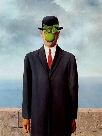
In these 2 works, he also dresses his subject matter up in smart suits, completed with bowler hat and combed up hair, which reflects the upper class men in the French society. But I guess it also reflects himself as he often wears a bowler hat and dresses up in smart suits. He also uses objects that are found in real life and he does not distort the objects like how Dali elongates and exaggerates the forms. However, he juxtaposes unrelated forms together like how he places the apple in front of the man with the bowler hat. He places many forms out of their usual context such that they look normal at first sight but upon closer inspection, we can tell that there is something wrong with the scene.


This is a somewhat humorous depiction of humans turning into fishes and blending in with the rocks. Magritte's famous sky motif is repeated here. Somehow, I would interpret the work as one that is mocking human existence as he compared us to fishes. >.<

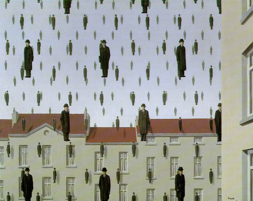
This is yet another painting of how Magritte incorporates Surrealism into everyday scene. It looks like it is raining man with bowler hats! O.O

 Even though I believe that art should contain a deep hidden message and that all good art should be "meaningful", I feel that Magritte is one successful artist who never fails to impress me with his stunning skills and out-of-the-world ideas and thinking. He is one artist who dares to try, and one that is not bounded by what he sees, but instead, is trying to challenge the boundaries of his imagination. That is why I credit him for being able to create such a paradoxical image.

My own version of "Personal Values"

I tried editing in photoshop, but it still looks blurry...>.< I think that my lines are too sketchy! The original looks much nicer though...
Bed
I love my bed - it is where I end my day peacefully. It is my resting place and a place of comfort. It is significant to me as it is an integral part of my life(in fact, everybody's lives) and I have been sleeping on the same bed ever since I was a kid. I like to daydream on my bed and my bed is important to me as it is where I retreat to when I am tired. However, I have been sleeping lesser and lesser for this past 2 years, and even lesser due to the ongoing NY 95th Anniversary musical, which makes me miss my bed a lot. So in comparison to some other objects, my bed looks smaller as I am spending less time with it now. How I wish I can go back to the times when I can lie on my bed for one hour to daydream. ):

Spectacles
I cannot survive without my specs! I must say that I am quite short-sighted-with a degree of 400 or higher. :/ Even though I routinely put in on and take it off, without any conscious thought, now as I reflect of the objects that matter a lot to me, I think that my specs is under credited. It has always helped me in my daily life and it gave me a clearer vision of my surroundings. Without it, I feel lost and kind of blind as my vision becomes blurred, which will hinder me greatly. Well, I cannot survive without my specs, so I shall list it as one of my most important personal items.

iPod
Well, my iPod allows me to have my everyday dose of music, so it is like providing a constant source of support. Music is like my vitamin and I think that my reliance on music has grown throughout the years. So I need my iPod everyday, to play the music that I need. I can also play with games when I am bored, like when I am on the bus or something. Well, lately, it has accompanied me throughout the long musical rehearsals and it is like my "watch", so that I can keep track of time! And not to mention, I can play with my iPod while waiting for the full runs to start. It can also help in my note taking as when I visit art exhibitions, I can record down information with the note-taking application. It is something that I must bring with me everywhere I go. I can choose not to bring my phone, but I cannot not bring my iPod along! (:

Guitar
My favourite music instrument of all! Even though I started playing the piano at like 5 years old, I don't exactly love piano as much as I love guitar, which I have only started playing last year. Playing the guitar can be quite addictive sometimes and I love the beautiful tones that it produces. Well, I still play it a lot even though I am very busy, as I like to slack off my time with it. When I am sick of doing work, I will just automatically take out my guitar to pluck and strum. It is one personal value that I will treasure forever as I enjoy playing the guitar so so so much(although it leaves me with painful fingers :/ ). It will be the musical instrument that will accompany me throughout my life.

Biology Textbook
Haha, some of you might think that I am a little crazy for putting this in. Well, I must say that Biology is my favourite subject and one that I will never fail to study because I rather study bio, more than any other subject. I bring it with me to school almost everyday, unless my bag gets too fat and heavy to stuff it in. I really think that Bio is fun to study and I just love flipping through the colourful diagrams in my textbook. (: There are nice little panda pop out stickers on its cover page and they are so cute! I just love my bio textbook!

Pencil and Eraser
They are two separate items but they can be classified together so I shall just put them together! Well, I will bring them everywhere with me, because I will feel kind of insecure when I do not bring them. :/ The pencil and eraser are considered to be the most important pieces of stationery in my pencil case. For me, I prefer to work in pencil as I can get quite messy when I use pen(but I think I use pen more because of school work) and it is the fundamental medium for my art making. I tend to be someone who makes a lot of mistakes when writing and I like to correct my lines when I draw, so I really need an eraser in my pencil box(but I lose it a lot...). Well, I treasure the pencil more than a pen anyway! Pencil is also the medium of this piece of work, so there is a great significance to it too!

Fluffy the Bear(?)
I don't even think that it is a bear cos it is an ambiguous little animal. :/ Very simplified version of a bear I guess! Anyway, it is the white little soft toy sitting quietly on my table in my room. I don't exactly take much notice of its presence because it is always there. But it is important to me as it was a gift from one of my best friends in primary school. She gave it to me last year for my birthday. We still keep in touch as of today(even though we are in different schools right now) and I am really glad that we have sustained our friendship for so long. Fluffy is like the symbol of our friendship, a friendship which I treasured a lot. I sincerely hope that our friendship will be a long lasting one. (:

The extra symbol (not exactly a personal value)- the sky wallpaper :D
This is the connection between Magritte's work and my work I guess...Well, for me, the notion of the sky is important to me as it appears in my coursework too(under the influence of Magritte). It also represents my wish to have an endless stream of imagination and creativity flowing through my brain as I believe that it is a gift to be creative! However, after decorating the walls with clouds, I realised that it looks quite distracting so oops, my bad. >.< But I still like clouds!

EVALUATION
As usual, it is a piece of work that is nowhere near the fantastic master piece of Magritte! It would take years of hard work before I can reach Magritte's standard! (I hope that I can) Anyway, as I said, the clouds look quite distracting and it will be better if I colour my work so as to differentiate between the background and foreground. But I am a little short of time so... >,<

But anyway, I feel that this mini assignment has allowed me to pause and ponder about the value that are important to me as I hardly stop to think about these things. The values shown here are not representational of all the things that matter to me though. For instance, I value relationships more than any materialistic good - be it kinship or friendship. I believe that having nice relationships with people around you is the most important thing for me. And Fluffy the Bear is only representative of one relationship - which is the nice and friendly relationship between me and one of my best friends! Well, I treasure all relationships and well, they cannot all be represented in this work! >.< But I thought that I this friendship means a lot to me as it is a somewhat "distant" relationship with someone that I don't see very often!
Anyway, bringing back to the topic on personal values, I believe that I have too many important personal items to fit into this small little work! There are just too many items that I interact with every day, such as my toothbrush and wallet(which is not in the work). So I would like to say that many items in daily life actually matter a lot to us, it is actually up to us to notice them. The question is not about how many personal values we have, but rather how many personal values we actually treasure.

Monday, August 13, 2012

Lucia Hartini & Frida Kahlo - Inspiring Female Artists


Lucia Hartini

Lucia Hartini is a female Catholic Javanese artist living in a Muslim dominated society, and where men power over women . From the beginning of her career in 1970s until 1993, she paints works which include powerful symbols to convey a complex narrative to her viewers. Her art is an interpretation of herself and her surroundings. Hartini's earlier paintings depicted cosmic landscapes and humans(children and later, grown-ups). In later paintings, Hartini often painted female figures which reflects her current situation. Her figures often look powerless, vulnerable, passive and obedient. In 1986, when Hartini painted this painting, she was struggling to be herself, so she has decided to depict her sense of terror in Spying Lens. This is a quote from Lucia Hartini:
 "It tells of my obsession with eyes, especially human eyes, which frighten me very much. They follow me wherever I go and they always want to watch my business."
SPYING LENS(1986) - Lucia Hartini


Principles of Design, Elements of Art
The orange-red brick walls that zig zag like a maze and the blue, fluid drapery cloth both dominate the whole composition, suggesting the notion of infinity and endlessness. The brick walls extend out of the frames of the whole painting while the cloth extends out of the composition after looping over the walls. In the foreground, an Indonesian woman clad in dark royal blue cloth can be seen. She is lying down, curled up in a fetal position,looking helpless and tired, seemingly engulfed by her threatening surroundings. She floats among the clouds, defying the usual notion of gravity. In the middleground, there are a few eyes shooting beams of light at the woman, scrutinizing her, watching her every move as if a surveillance camera. The glare of these few eyes have caused the woman to cower in fear and she close her eyes in a submissive pose. In the background, purplish red clouds can be seen. The clouds look ominous and foreboding due to the unusual surrealistic colors that the clouds are painted in. The clouds seem to be travelling into the maze, occupying the space inside the maze and they encroach towards the woman, suggesting the approaching danger. The composition of the painting is quite nicely balanced as each symbol contributes an equal weight to the whole painting.

Lucia Hartini has painted this painting using realistic, fine and detailed brushstrokes. She depicts the forms in a photorealistic manner, capturing every detail and tone of each and every form to portray an accurate looking, but fantasy-like world. However, as much as the forms are photorealistic, the forms are also very subtly exaggerated and "distorted" in a way. The folding of the woman's cloth is heavily exaggerated, which distorts the usual form. She also uses complimentary colors of bright orange and blue to contrast the woman and the brick walls, juxtaposing them starkly, so that they seem to be placed together in harmony on the surface, but a sense of tension is hidden underneath this seemingly harmonious setting. The complementary colors also serve to bring out the fact that the woman is most probably different from others as she stands out, which contributes to the tension in the work as it suggests that she is a misfit in society. The rigid and angular brick walls also contrast with the fluid, flowing lyrical quality of the woman's cloth, which also serve to emphasize the point that this woman differs greatly from her surroundings and this also creates a sense of uniqueness in the work as it means that every form is important and different from the other. The background, which is dominated by dark clouds is in a darker tone as compared to the foreground and the middle ground. This serves to bring out the presence of the brick walls and the woman, thus drawing the viewer's attention to the main subject matter of the work. The darkness of the clouds suggests the notion of approaching danger, contributing to the ominous presence of the clouds.

SYMBOLISM

Lucia Hartini is unable to directly portray her frustration towards the oppressive nature of her Indonesian society as by expressing her feelings directly, she will only be subjected to increased scrutinization from the society. That is why she must hide her intended message cleverly in her paintingss. That is why she employs the clever usage of various symbols, and due to the juxtaposition of the symbols and the heaven-like setting of the work, her work is being categorized as a "Surrealistic work".

The symbols in the painting relate to the personal life history of the artist, but the symbols are actually based on imagination as they are not commonly found objects that we will see in our daily lives, which contrasts to the symbols used in Rene Magritte's Personal Values. Nevertheless, these symbols are juxtaposed together to reflect Lucia Hartini's terrified state of mind, her status in society, and the nature of the oppressive Indonesian society.

Her symbols are relatively accessible as they together, tell a story - Lucia Hartini's life story. The symbols that she use actually have a literal meaning. For example, eyes relate to spying and the foetal position of the woman relates to the idea of being helpless and scared. Due to this fact, the viewer is able to decipher the symbols rather easily and be able to read the narrative behind the painting.

Lucia Hartini includes herself in the work, and the surrounding symbols actually alludes to her personal life experience and her current feelings of the things that surround her in daily life.
The cowering woman represents Lucia Hartini 's state of mind and the woman's pose suggests that she is fearful, afraid of the evil watching eyes of the Indonesian society. As an aspiring female artist, she feels suppressed by society as in the Indonesian society, the common believe is that a woman should work in households, supporting her husband and children. She is also a catholic in a Muslim-dominated society, which just emphasizes her difference from others. She strongly believes that women can achieve so much more and that they have the rights to accomplish what they want, but she is unable to voice out her views directly as this may cause society to scrutinize her even more. Therefore, she employs the use of symbolism to convey her hidden message to the viewers.
The brick walls and the watchful eyes represent the society and its fixed mindset. The walls are zigzagged in a way that they seem to form a maze, an endless labyrinth, entrapping the helpless foetal like woman. This shows that as an aspiring female Indonesian artist, she is trapped and suppressed due to society's mindsets. The eyes represents society's watchful eyes on her, scrutinizing her moves, so she can only succumb to the eyes of society as she cannot face the society alone. The colors used also represent a certain message that Hartini hopes to convey.
The blue cloth represents Lucia Hartini's desire to become as strong and tough as the female warriors who protect the sultan. The female warriors are usually clad in blue and by allocating this color to the woman's clothing, she expresses her wish to become as brave as the female warriors, so that she can stand up to society to fight for woman's rights. The wrapped cloth is also symbolic of a safety net to hold and support her, like the umbilical cord for the foetal like woman. It protects her, which symbolizes her wish to be protected from the dangers that surround her, which includes her society and this also stems from her history of being a domestic violence victim.
The clouds represent the approaching danger as they seem to be crawling towards the helpless woman. It can also represent Hartini's fear of the unknown - she does not know what lies ahead of her and she hopes that all this horror is just a mere dream.
The use of colour also adds to the symbolism in the painting.
The strong and bold orange colour of the brick walls symbolises society's power over her. Orange is a brighter colour as compared to the dark navy blue, so it is like society exerting its power to suppress her. This shows the unbalanced powers of the woman and society, which shows that she is weak and powerless as compared to society. Through this painting, Hartini conveys her struggle for self-empowerment and  desire to attain freedom from the norms and judgement of her society.


HER OTHER WORKS:


I would say that Lucia Hartini has a distinctive style. She paints with photorealistic brushstrokes but in each painting, there is the notion of exaggeration and slight distortion. But I would say that her paintings are definitely surrealistic due to the unusual placement of symbols and the symbols themselves look out of usual context. Her painting is often dominated by a woman figure, who is most probably Indonesian as suggested by her skin colour. Hartini paints her paintings to convey a serious message like her current state of mind and in some, she criticizes the society in which she is living in. There is the repeated use of clouds too as clouds make the whole composition look surrealistic. She especially like to exaggerate and elongate the woman's clothing and the clouds that surround the woman. The cloud symbols in her paintings look bold, unlike normal clouds, which look soft and fluffy. In her paintings, the clouds look very solidified and outlined, suggesting a menacing presence.
Her paintings also have a common colour scheme - the widespread usage of the colour blue. And in most paintings, she contrasts blue with other complementary colours such as orange. So I would say that her colour palette is somewhat more limited as compared to some other artists, such as...Frida Kahlo.

Frida Kahlo's biography(in 6 parts):


COMPARISON WITH FRIDA KAHLO
Both are self-taught female artists who have suffered a lot and they have gone through the turbulence of life. Lucia Hartini is an Indonesian artist while Frida Kahlo is a Mexican. Both artists show the clear influence of Surrealism in their works and both artists like to paint their personal reality in their works.
 Lucia Hartini paints often paints a woman(which seems to symbolise herself) in her paintings, among the clouds and other unusual symbols. This symbolises the suppressed female artist living in a male-dominated society. She, like Frida Kahlo, had suffered miscarriages and lost her child in the process, which had scarred her emotionally. Like Frida Kahlo, she has painted "self-portraits" to depict her pain of losing her child, which shows the motherly sides of both artists.
In this painting, which is titled "Communication Between Mother and Child"(1989), she depicts herself as a helpless mother who is searching for her lost child. She felt sorry that her child's life cycle had ended so quickly and that how she did not have a chance to hold her baby in her arms. She depicts her child as a baby who is now in heaven, but still protected by the amniotic sac and the umbilical cord, which shows how much she loves her child and how she longs for him/her to be born. She is portrayed as a mother who is chasing after her baby and trying to connect with it, but her efforts are futile as heaven and earth separates them. So now, she can only express her love and longing for her unborn child through this painting.


In "Henry Ford's Hospital"(1932), Kahlo depicts herself as a naked, bloodied and crying woman. She had just lost her child and she seems to be in severe pain while the rest of the world can only sympathise, watch and just move on. However, Kahlo herself was unable to let go of the jarring pain that she felt, which caused her to paint this self-portrait, so that the world will forever be reminded of her pain and her tortured existence. In this painting, she holds on to 6 red threads(which may symbolise the umbilical cord) which connects to symbols that are related to her miscarriage. For example, the baby that she was unable to keep, the cruel and cold machine that snatched her baby away from her, her pelvic bone which was damaged during the fatal bus crash, her injured uterus which caused her infertility and the snail, which symbolises her slow and painful recovery from this incident.

 __________________________________________________________________________________

  
Frida Kahlo often paints her self portraits, which are heavily laden with symbolism to depict the sufferings in her life. Kahlo has met with an accident when she was very young. Another major obstacle in her life would be the volatile relationship between her and her husband, Diego Rivera. Frida has also had 3 miscarriages and had gone through many operations which include knee operations and spinal operations. Both of them had affairs and the most devastating fact was that Rivera cheated on her for her sister. This incident had left Frida brokenhearted. They divorced and after one year, they got back together again. 


COMPARING SPYING LENS AND SELF PORTRAIT WITH THORN NECKLACE AND DEAD HUMMINGBIRD
File:Frida Kahlo (self portrait).jpg
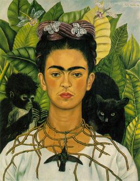
Self Portrait with Thorn Necklace and Hummingbird(1940)

Both works are depicting the sufferings in life that the artists are going through at that point in time. Hartini is being oppressed as an aspiring female artist while Kahlo is suffering from a heartbreak. Kahlo's self portrait has a central focus and the central focus is the artist herself, while Hartini juxtaposes the woman against her surroundings. Frida Kahlo's style is more primitive and native as compared to Hartini's, which is more exaggerated. In Hartini's Spying Lens, complementary colours such as blue and orange are used and her colours are in darker tones as compared to Kahlo's self portrait. In Frida's self portrait, the colours are excessively bright. Both works contain the notion of exaggeration. Hartini exagerates the foldings of the cloth, contributing to its flowing fluid quality. Kahlo exaggerates the textures of the succulent leave, which reflects Kahlo's interest in native Mexican art. Kahlo places her face at the central focus of the painting, such that she dominates more than half of the composition, making her presence felt, whereas in Lucia Hartini's case, she places the woman as a small figure, surrounded by foreboding and overwhelming clouds and brck walls. Therefore, the focus of each painting is different, so as to convey each artists message more effectively.

In both paintings, each artist has employed the heavy usage of symbolism to convey their personal struggle. Hartini struggles from suppression of the society and aims to break free while Kahlo wants the viewers to see herself as a tortured existence. The symbolism they use to represent their state of minds are also different. Since I have already discussed the use of symbolism in Hartini's work, I shall just discuss the symbolism in Kahlo's work.
Kahlo's face and upper body dominates the whole composition and her face is the central focal point of the painting. Her hair is dressed in a traditional Mexican style, which reveals her strong sense of Mexican identity and her pride in being a mestiza, a Mexican of mixed European and Amerindian ancestry. She depicts herself as a combination of a Christ-like figure and an Aztec goddess here. In this painting, she is depicted as a strong, resilient woman who is broken on the inside, as her unwavering gaze suggest sadness but the desire to stand strong. She stares at the viewer with a strong and seemingly bold gaze, but on the inside, she is suffering, hurting as suggested by the thorn necklace that she wears. This suggests that she is suffering in silence and can only convey her emotional and physical pain through her paintings. The dragonflies and butterflies around her head are Christian symbols of resurrection, representing hope and her desire for rebirth, to free herself from her mental and physical suffering.
There is a black cat peering over Kahlo's left shoulder. It is traditionally a symbol of bad luck and it watches the dead hummingbird hanging beneath Kahlo's throat with unfriendly eyes, as if ready to pounce on it. On her right shoulder, her pet monkey is playing withher thorn necklace. Monkeys are mostly symbolic of the devil or lust, but to the artist, this monkey symbolises the love that she was not receiving from Rivera. The monkey looks playful, which may also represent the child she could not have because of her ill health and bad physical state. Frida Kahlo is wearing a thorn necklace which is piercing into her skin, causing blood to trickle down. This allude's to Christ's sufferings and also to her own pain, and it also reveals her roots and patriotism. A hummingbird hangs from the centre of her necklace. In Mexican tradition, a hummingbird represents luck in love, but hers is dead, which means that she has lost all her luck in love. The usage of animals as symbolism in her self-portrait also reflects Kahlo's love for animals. Kahlo had many pets to keep her company as she had sadly realized that she would be unable to bear children for a lifetime due to injuries in her uterus, as a result of the bus crash incident which has led to more than thirty operations in her life.


My personal preference

I would prefer Frida Kahlo's painting as I think that it is a very open reflection of her suffering and emotional pain. Lucia Hartini's work does not convey the strong sense of suffering as the woman in her painting is passive, weak and she is even wearing a smile on her face!  Both artists have gone through a lot of sufferings but I think that Frida's life story is a more painful and dramatic one, so I sympathise with her. She has been through physical sufferings ever since she was young - she has contracted polio at the age of six and met with a fateful bus crash which has left her with serious injuries in her uterus, spine, ribs, pelvis, collarbone and right leg. Later in life, due to gangrene, she had her right leg amputated in 1953. She then died of cancer at the age of 47. She has also been emotionally scarred throughout her life by her husband, the womanizing Diego Rivera.

"I was born a bitch. I was born a painter."
"My paintings carry with it the message of pain." - Frida Kahlo


Sunday, July 29, 2012

M.C Escher - The genius

Reptiles by Marius Cornelius Escher, 1943 (Lithograph)


Description and Analysis

This work depicts a seemingly ordinary desk. On top of the desk, there is a tessellated drawing of reptile forms which are closely packed. The tessellated reptiles seem to come to life and emerge from the paper's surface, coming to life as a living reptile. After the reptiles become fully 3 dimensional and alive, they crawl around the cluttered desk, over multiple everyday objects such as a book and set square before they eventually descend and re-enter the drawing. The desk is covered with several ordinary mundane objects such as a cactus pot, a wine glass and bottle, several books and most prominently, a metal dodecahedron. The reptiles climb over the dodecahedron and the one standing on it appears to be blowing smoke from its nostrils, suggesting that it has fully come to life and this symbolises the reaching of the peak before descending to eventually merge with the 2 dimensional tessellation pattern.

The forms are depicted in such fine and photo realistic strokes, and yet the juxtaposition of forms and altering of sizes makes it unnatural. The movement of the baby crocodiles is contrasted against the relative stillness of the surrounding objects, creating a silent tension in the work. The organised arrangement of the ring of crocodiles also adds to a rhythmic fluidity. He has effectively portrayed the mathematical relationship among shapes, figures and space in this work. Different forms seem to interact with one another in this work and every form is interlinked. There is a contrast and contradiction of still-unproportional objects with the moving reptiles(the still and upright vs. fluid movement). The contrast between the hard, angular edges of some objects on the table to the relatively soft and rounded form of the reptiles also make the work look interesting.

The composition is rather well balanced, making it look like an ordinary table top which is filled with objects. The objects look like they are randomly strewn about on the table but the objects are clean and posed, which makes the viewer feel uneasy due to the irony present in the work. The forms are distorted in terms of their size so when they are placed side by side, they look starkly juxtaposed.
Different heights of the objects create variation and 3 dimensionality in the work and the ascending and descending movement of reptiles guide the viewer's eye movement in a circular motion.

A tonal variation of gray exists in the work, which contributes to the shadows so as to portray a realistic depiction of forms. The different tones of gray are carefully placed and Escher makes a meticulous effort to differentiate his forms from each other through the use of tonal gradients. The colours play a crucial role in helping us to make out the positive and negative spaces in the work. They also add a sense of depth to his work, so that his work stands out of a flat 2 dimensional surface.
This work by M.C. Escher is a seemingly ordinary work which exudes a subtle sense of creepiness, which is further reinforced by the usage of black and white tones, as if suggesting something ominous. Textures also exist in the work, which is further highlighted by the fine realistic brushwork and application of tonal gradients. For example, we can clearly see the roughness of the reptiles' backs due to the realistic depiction of their body. This allows the viewers to feel the details of the work and appreciate every surface of each form.

The reptiles existing in this work can be split into 2 distinctive groups which serve as a contrast to each other: The simplified, abstract forms vs. the detailed, sculpture-like forms. 
The use of perspective here and impossible spaces is cleverly employed by Escher. He uses the carefully arranges the baby crocodiles such that they form the guiding line for the viewers' eyes, allowing them to explore the work that Escher wants them to. There are also multiple focal points in the work, but the central focal point would be the tessellation pattern as it is enclosed by a ring of crocodiles, emphasizing the subtle presence of the 2 dimensional geometrical pattern. The reptiles are arranged in a cyclical formation, such that they travel in a never ending circle, suggesting the notion of the infinite. It is like the life cycle of the reptile, where they ascend from the 2D surface to become a 3D form and then descend into a 2D form again. This is a cycle of continuous and endless resurrection, continuing into infinity.
 The 2 dimensional reptiles are simplified and abstract, with just the basic outlines to define their forms. These singular geometrical, hexagonal and angular reptile forms also contribute to the basic unit of a tessellation, in which these shapes are arranged differently to complement each other. The tessellation repeats itself like a continuous multiplication of forms. As 2 dimensional as it may seem, two "uncompleted" tessellations are actually partially transforming into 3 dimensional reptiles, contributing to the magical element of the work. This reflects Escher's witty play of the reptile figures in a regularly divided plane, adding to the surrealistic quality of the work. There is a repetition of the reptile motive in both 2D and 3D form, and this recurring image makes the viewers question the individuality of the reptiles and the "over-usage" of reptiles which look menacing is actually creeping the viewers out, making them feel uneasy. The merging of 3 dimensional and 2 dimensional forms is as if as Escher is playing with our subconscious mind by telling us to question what the true form of the crocodiles are. The distinction between a visual art piece and stark reality becomes less defined, playing with our senses and confusing them, and this adds to the surreal quality of the work. He deceives us with perspective and perception. He is telling us that the impossible is happening right before our eyes. The idea of metamorphosis is present. The most obvious one would be the morphing of 2 dimensional forms into 3 dimensional ones and vice versa.
Escher has also employed the use of several mathematical concepts in the work. It is evident that he has used the concept of rotational symmetry to create his reptile tessellation. He has also used geometric shapes in his work. The books and the cigarette box form the more rectangular shapes while the glass cup, the bowl and the cactus consist of more circular shapes.

Interpretation
Along with many art critics, I believe that Escher's work does not hold any deep meaning to it - the image is created to depict a paradoxical world and it was created because he felt like creating it. I do not think that there is a philosophical or hidden message behind this work, unlike many Surrealist artists like Rene Magritte who use symbolism to convey hidden messages in their works.

I think that through this work, Escher has expressed his interest in mathematics, particularly geometry and tessellation. He likes to explore the idea of infinity and the idea of "creating the impossible reality" and he has created many works due to his fascination and desire to share his excitement for the idea of eternity. The objects on the table and reptiles are both arranged in a circular manner, providing a cyclical frame to the whole composition, which again brings out the notion of infinity, as a circle is never-ending. He has created a paradoxical, unrealistic world which looks bizarre and mystical at the same time. His interpretation of mathematics has been a recurring basic idea of most of his works, such as the print below, which shows the never ending journey of ants.

Evaluation
 I believe that Escher has achieved his aim of creating such a surrealistic image. He has also demonstrated his skill and proficiency in his chosen medium - lithography, making him a skilled and creative artist. He was actually considered to be the creator "of some of the most intellectually stimulating drawings of all time" and the king of visual illusions.
Even though his lithograph did not aim to bring out any message, but he is definitely successful in creating an ironic reality. Although surrealistic works are usually heavily laden with symbolism, I believe that Escher creates are because he wants to and because he is passionate about art, so I shall respect his intentions to just create a paradoxical image with no specific message behind it.

No matter what, I believe that it is one spectacular piece of work that is meticulously created with skill and precision.

COMPARISON WITH ESCHER'S OTHER WORK

Personally, I think that Reptiles can be compared to many of his Lithograph works, as the idea of infinity and impossible, warped spaces is a common theme that is repeated. Escher is a master of visual deception, bewildering us by presenting impossible images which actually look possible.
However, I think that Reptiles bear the most similarities with Relativity(1953) so I shall choose this work for comparison.
Both Relativity and Reptiles are created using monotone colours of mainly black and white, with tonal variations of grey. The different intensities of the tones used actually bring out the sense of depth and space in each of the works, but it is more prominent for Relativity. In Relativity,  the central focus, which is encircled by the triangular formation of the oddly positioned staircases, is of a lighter shade as compared to its surroundings. This effectively draws the audience's attention to it and highlighting the fact that the arrangement of the staircases is practically impossible but what is strange is that this strange arrangement seems to be calmly set up and placed together, which makes the work even more puzzling. The usage of impossible spaces is very prominent in both works. Reptiles play with the idea of merging 2D and 3D planes together, while Relativity defies the notion of having a single perspective, by merging many types of perspectives together, making the viewers question what is upright and what is not. The use of positive and negative spaces to create a sense of depth in both works, bringing us through a seemingly impossible and unknown image. However, the setting of both works are different. In Reptiles, the subtle action takes place on a table top, while in Relativity, there is more action and chaos, as the whole scene is taking place in an upside down, downside up world, defying the notion of gravity. Both employ the use of diagonals to create the notion of infinity and endlessness. Furthermore, to make his works more interesting, Escher places characters which are alive into both works, contributing to the sense of movement and liveliness in the monochromatic works. The characters in both works have lost their personal identity and they look similar with the other characters in the same work, creating a sense of uniformity. In Reptiles, there are a few 3 dimensional alligator-like creatures crawling over the table and metal dodecahedron, but the reptiles look oddly symmetrical to each other, like the symmetrical and repeated patterns of  the 2 dimensional reptile tessellations. In Relativity, the abstract, simplified human forms are faceless, stripped of their personal identity to become emotionless, random people made to live in an impossible world. However, I feel that the characters in Relativity are more interesting. Each character, although similar to one another, is engaging in a specific unique activity. They can be climbing the stairs, looking over the balcony, carrying objects, interacting with each other etc. This gives the supposedly identical clones a unique identity as they are different from each other, making each character special and essential for the vitality of the work. In Reptiles, the reptiles are just merely climbing over the different objects with the ultimate aim of re-entering the flat 2 dimensional tessellation surface and resurrect again. Since they are all crawling, they lack the personal identity as they are all engaging in the same activity. Therefore, the viewers will not specifically take notice of each reptile unlike in Relativity, where each character is different in its own way. One unique fact about Reptiles is that Escher contrasts the 2 dimensional and 3 dimensional forms, while in Relativity, Escher plays with the placement of 3 dimensional forms. The forms in Reptiles are portrayed using more realistic brushwork while the forms in Relativity are depicted in a more simplified and abstract way, so as to bring out the absurd use of perspective present in the work.

Personally, I feel that Relativity has a greater impact on the viewers. Reptiles is a subtle and slight distortion of our everyday world, but Relativity is the stark and obvious manipulation of our everyday world, twisting it into a strange, foreign world. The use of impossible spaces is more obvious in Relativity and I think that this image will create a deeper impression as compared to Reptiles.  There is a subtle juxtaposition of unrelated forms in Reptiles, but in Relativity, the juxtaposition and unrealistic arrangement of forms dominate the whole composition, morphing the whole composition into one magical world. Furthermore, there seems to be a lack in shadows(the character's shadows) in Relativity but there are shadows in Reptiles. Relativity is obviously distorted while the distortion present in Reptiles is more subtle.


"Only those who attempt the absurd will achieve the impossible. I think it's in my basement...let me go upstairs and check. "  -MC Escher


Escher is indeed one witty artist who sought to combine art and mathematics harmoniously, bringing out the best of both worlds.


COMPARISON WITH ANOTHER WORK


I would also like to contrast Reptiles with this beautiful art piece that I have seen at the SYF Arts and Crafts Festival. It was one of the first few works that I saw at the gallery and I was immediately captivated by the work when I saw it! It is carefully drawn out using a fine black pen, with intricate lines and careful, meticulous shadings. This work is simply breathtaking. I love every part of it - from the graceful fluid forms to the photorealism of this piece. (I'm really sorry, I didn't record down the title of this work! >.<) I think that the artist was influenced by a number of surrealists. The spirals actually remind me of Dali's works as Dali uses a lot of fluid spirals in his works. The usage of the clouds imagery is reminiscent of Magritte. But Escher's influence is the most prominent in this work as they can be closely associated.
This young artist was most likely influenced by MC Escher's bizarre looking, paradoxical lithographs. The ideas of infinity and endless cycles are present in both works. Even their subject matter is somewhat similar! The reptile form and the repeated use of tessellation are present in both works! However, the setting is different. In this work, the setting is among the clouds, adding a surrealistic element to it, while Escher's image is taking place on top of a table with everyday objects. Both works use shapes, especially circular shapes, to suggest the notion of endlessness and continuity. But the use of spirals is more dominant in this work.  For Escher's, the spiral is quite subtly formed by the reptiles which are crawling over the table. In this work, only one reptile can be seen and it is magnified, dominating the whole composition, with intricate, repeated patterns carved unto his back. In Escher's work, there are a few reptiles present and all of them seem to look identical to each other, thus losing their individual unique identity but in this work, the reptile is unique as it stands out, different from the reptiles that we encounter in everyday life.
While the use of monochromatic colours is prominent in both works, both artists use different medium to portray their image. Escher uses lithograph, while this artist uses the humble pen. This young artist has also adopted Escher's use of tessellation and incorporates it skilfully into his artwork! Credits to him/her for being able to do that!


By the way, Escher has not only influenced this young artist over here, but he has played a part in shaping the modern entertainment industry!
The movie poster of Inception shows the influence of Escher's concept of distorting perspectives in modern media. (Mrs Tan showed this to us in sec 2:D )Escher's ideas are still passed on as of today, inspiring many people in the arts industry. This shows that artists who are influential and stand out of the crowd will not be forgotten. Escher's ideas have also influenced a number of artists such as Makoto Nakamura. Many artists employ the use of impossible and warped spaces to construct their works. Like Escher, optical illusions and visual deceptions are common features of their works.


TESSELLATIONS

Escher uses mathematical concepts to create his works. For example, for the reptile tessellation, he employs the use of rotational symmetry to create reptile forms carefully joined with one another, leaving no gaps in between. He has experimented with the forms, morphed them, twisted them and abstracted them to suit his liking. The idea of positive and negative space is clearly used to differentiate each tessellation piece. His tessellations have effectively combined the great ideas of mathematics and art.

Here is a video on the mathematics in Escher's art! (:


As the video has pointed out: "The legacy lives on". Indeed, Escher's ideas are still influencing us up till today and this genius will never be forgotten. By the way, many mathematicians admire and actually love Escher's works(well, because it fuses both math and art). The works that he had created have merged both science and art, which used to be 2 separate fields. I believe that this is what differentiates him from many other artists. His works have a continuous influence in both science and art. His ideas have been used in philosophy, topology, crystallography etc.

Here's a video of a 3 dimensional sculpture of Escher's Waterfall. Well, I thought it was impossible to construct, but the guy in the video just did! O.O How did he do that? Maybe he employed the use of several mathematical concepts to create this seemingly impossible construction.


To end off the post, here is an Escher documentary: