Saturday, March 24, 2012

Annie Leibovitz

I shall dedicate one post to this photographer! (: As an aspiring photographer(ok, I am not that good >.<), I really look up to her as my role model. She is the first photographer that I ever took notice of! I went to her exhibition- A Photographer's Life, 1990–2005. I even bought post cards of her works(but I can't find them now) :(

She is a skilled yet controversial photographer. Some of her works may seem shocking at first! Here are some photos which really striked me when I first saw them in the exhibition!

My all time favourite Nicole Kidman photo! (: Saw this at Art Ateg 2012! I always feel awed at the golden lighting of this photo.

Photo of Queen Elizabeth II. My dad told me that she had angered the queen by asking the queen to take her crown off!(Well, she eventually did anyway)

This made the cover page of the magazine Vanity Fair. It was a controversial photo at that time!


Illustration Artists(:

Went to Kinokuniya and chanced upon a book full of illustrations of modern artists.

                                                                      
                                                                         Yosuke Ueno

Her style resembles the Pop Surrealists' style! But not as morbid as Mark Ryden's(read post on Mark Ryden to get a better idea!). Her subject matters are more innocent-looking, carefree and cheerful. There is still distortion and exaggeration in her works, with arbitary colours. Her colour palette is bright and colourful, adding to the spontaneity of her works!


                                                                            Adolie Day
I think she specialises in computer graphics! (: Common subject matter: girls. The girls look so sweet!


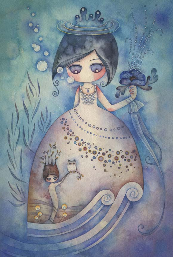
Juri Ueda
The colour appears is diluted, like water colour. However, there is the tinge of innocence and naiveness in her work, with the girls' big eyes and angelic looks. Her works are gentle- both the subject matter and the colours are, which makes the works aesthetically pleasing! The colours are smoothly blended, which adds to the softness of her works. The girls in her works are surrounded by fantasy, which hints at childlike innocence. Her works are subtle and quiet, but they are imaginative. She is my favourite artist in this post! (:


Candy Bird

Another artist who likes to portray girls. I realise that different artists have different styles of portraying girl figures and each portrayal conveys a different feeling!


Ciou
Her style is quite different from the rest of the artists in this post. It is bold and daring, with varying thickness of outline. The contours of the forms are defined sharply by the use of bold lines. It is graffiti style, and forms are cartoonized.


Friday, March 23, 2012

This is kind of cool, it is like incorporating animal features (horns) into the head! 
Found on tumblr, but I never recorded the source. ): 


Wednesday, March 21, 2012

Inspirational (:


                                       The Nature of Implicity(2012)  - Mary Ann Wakeley
Bold use of colours in the abstract painting. Exploring the notion of simplification and abstraction with contrasting colours of different degrees of dilution.


                                                                  Jonathan Bergeron.
                                            His website: http://johnnycrap.tumblr.com/
I like how he manipulates the forms and morphs different, unrelated objects to form one whole recognisable thing. His creativity is wicked! Imaginative...
     It is like replacing the eyes with button-like objects.

Art made from paper. (:
It shows how paper can be used to form cool sculptures too!!!!
All paper sculptures by Su Blackwell(she is added to the list of my favourite artists now!) Such intricate and detailed stuff. Such a genius(and one with loads of patience)! She takes books and turn them into art that is extraordinary!


"I often work within the realm of fairy tales and folklore. I began making a series of book-sculpture, cutting-out images from old books to create three-dimensional dioramas, and displaying them inside wooden boxes.
”For the cut-out illustrations, I tend to lean towards young-girl characters, placing them in haunting, fragile settings, expressing the vulnerability of childhood, while also conveying a sense of childhood anxiety and wonder. There is a quiet melancholy in the work, depicted in the material used, and choice of subtle colour.
Paper has been used for communication since its invention; either between humans or in an attempt to communicate with the spirit world. I employ this delicate, accessible medium and use irreversible, destructive processes to reflect on the precariousness of the world we inhabit and the fragility of our life, dreams and ambitions."
-Su Blackwell
 
More pretty art from:http://www.sublackwell.co.uk/portfolio-book-cut-sculpture/

Sunday, March 18, 2012

Sec 3 EOY - SUCCESS!

SUCCESS
2011
Medium: Acrylic and Pastel

Well, I was running out of time, so I decided to use pastel for the large areas(the sand in the hourglass, the candle wax, the light from the flame, and the black surroundings).


Prep work for composition:

Overall, I am quite satisfied with the finished product and my prep! (: Hard work pays off! However, I could have experimented with the acrylic more as I only have one page of coloured prep work... I could have refined the details on the final piece too!(If I had more time). Would have done better if I had more practice on the handling of acrylic.


MEANING OF MY WORK: The artwork is supposed to portray the journey towards success and not only success itself. I personally feel that the journey is more important than success itself, as we can learn a lot on the way towards success! Reaching the goal is just a small achievement, tackling the obstacles along the way is more fulfilling!  

Will post the rest of my prep when I have the time. (:

Michael Cheval


Well, the theme is supposed to be ILLUSIONS OF ABSURDITY.
The morphing of one form into another is really cool. I feel so motivated to do some cool composition like this(well, if I have the skill and creativity).


"Anyone of my paintings is a map of my journey into illusion where sometimes you can find errors and miscaculations, but these are also part of the game. Game with absurdity."
                  
                                                                                                                       -Michael Cheval

Saturday, March 17, 2012

“I find it so much easier to be creatively free at night. Daytime is for sleeping. Nighttime is the best time for making art. The later at night it gets the further into another world you go.”  

― Mark Ryden


Haha, cos he is a pop surrealist. (: And you can dive into the surreal world at night (: