2012
Oil on Canvas
Finally done after a 2 month hiatus! :O

Front view(:
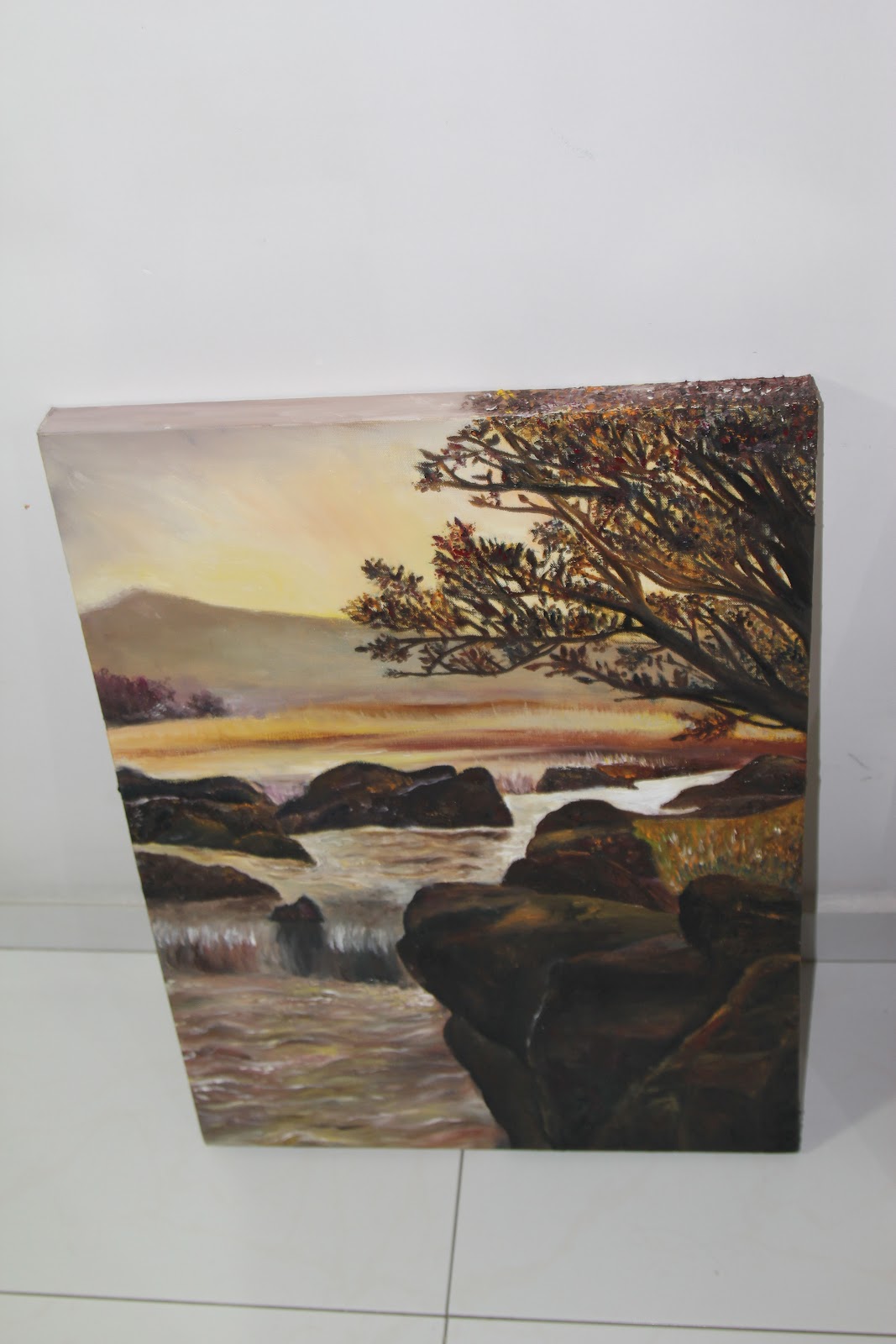

Top view and side view! (Yay I painted the sides!)

The starting point. :/ Yellow wash as the base with rough outline of forms using charcoal. It looks like a desert that was hit by a sandstorm. >< As you can see, the starting is really...simple, I only drew the basic forms because I wanted to paint so badly(or maybe I was too lazy :/ ) and I can eventually correct the forms by applying layers of oil paint! By the way, the completed work is filled with textures! The rocks and tree are rough and 'pokey'! :)
The colours are mostly applied by imagination and even though I did refer to the original picture at the start, I realised that it is quite impossible to capture every single detail and every colour accurately. So I gave up on referring to the picture and start applying colours based on what I feel as I believe that this will give the painting a sense of personality.(:
I like this painting because it has a warm feel to it. XD
OMG!! I am speechless!(: it is really pretty and looks very REAL!!(:
ReplyDeletehi xinying!
ReplyDeletei think this oil painting is really spectacular! i like how you documented the steps of your painting process, i.e. the layers beneath the final piece, and i would really like to say that comparing this to your previous oil paintings you have really improved a lot! your brushwork has become more refined and you have successfully manipulated colors e.g. white, to appear to be reflecting light. your rocks also appear to have a very rough texture given that you layered differing color upon color and the effect of it serves to give your painting a photorealistic quality. i like the fact that your background is ambiguous, and the mountains behind is covered with soft colors that seem to fade into the background. it is nice that the background does not compete with the foreground for our attention. this create a sense of balance and harmony between the background and foreground and ultimately, the whole painting. i commend your efforts to pre-plan the work! i have never done oil painting before and i think your documentation of your work has shed some light to me if i decide to embark on my own oil painting journey some day later!
I am speechless too! ^^ k anyway i really think you have made great progress since the start, especially because i witnessed you working in the initial stages. The brushwork and texture is really intriguing, the way you work in layers to create relief. Also the photorealism adds to the emotions expressed upon looking at the work. The warmth of the sunset glow is easily felt by he viewer, and the contrast of dark and light further emphasizes this effect. Great work and continue to pursue your passion!!
ReplyDeletebtw i think your background theme for this blog is really cool and colorful, showing your vibrant and passionistic personality.
Just to add to my previous post, i feel that an AFI would be that the tree is not detailed enough, as i feel that a broader range of colors could be used. Perhaps this would fit better with your excellent execution in portraying the effect of light in the rest of the painting.
ReplyDelete